5 Tips for Choosing a Minimal WordPress Theme
The famous interior designer and furniture maker Francis Jourdain once said that “one can furnish a room very luxuriously by taking out furniture rather than putting it in.”
If you take a look at some of the most popular luxury interior designs we see today, you’ll notice that most of them have very little furniture, decorations, and objects. That’s because keeping a lot of space between objects makes everything look more attractive, and feel more spacious.
The exact same thing can be said about a website design. When there’s relatively little text and images on a web page, we tend to pay more attention to the message the website tries to deliver.
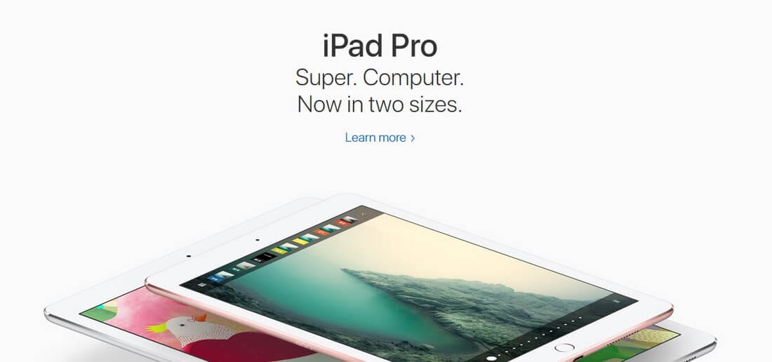
If you’ve ever visited a landing page for an Apple product, you may already have an idea about what a minimalist website design looks like. Apple uses minimalism quite effectively throughout its official website to capture user attention. Minimalist is a popular trend, and a lot of WordPress website developers and bloggers are now also showing interest in switching to minimalist themes.
Picking out one of the best minimal WordPress themes is not an easy task. because most minimal themes on marketplaces often don’t live up to their name. So, you need to know how to spot a great minimal theme before you begin your search! In this article, we’ll give you a few tips on how to choose a great minimalist theme, with plenty of examples.
The Benefits Of Choosing A Minimal Theme
Using a minimalist theme for building your WordPress website will not only make your website look more attractive, it will also improve your website in many different ways:
- More Focus On Content: Big, bold headlines are easier to read than 300-word paragraphs. Less content means more attention given to the parts that matter.
- Faster Loading: When there are fewer items to load, your website will require fewer server resources, download less content, and load faster.
- Easy Maintenance: There’s no need to go changing dozens of images and re-writing paragraphs of copy whenever you release a new product. There will be only a few items to replace.
- Better Reputation: When there aren’t any annoying sliders, pop-up messages, or ads appearing out of nowhere, people will consider you and your brand to be more professional.
- A Timeless Design: It doesn’t matter if flat design is dead, or parallax scrolling is no longer effective, your minimalist design will always be relevant. Apple’s website design has been pretty much the same since the release of its first iPhone in 2007.
Here’s what you need to keep an eye out for when looking for a great minimal WordPress theme:
1. A Clean Layout
A minimalist WordPress theme has to be clean and lean, which basically means you should see lots of white space throughout the design. This negative space is what gives your website design and its content purpose. Think of it as an empty canvas where you get to draw your best piece of art.
But, the layout of your content design should also play well with this white space. This means it should be arranged in a way to compliment the negative space. Like using grids and block layouts for showcasing the content.
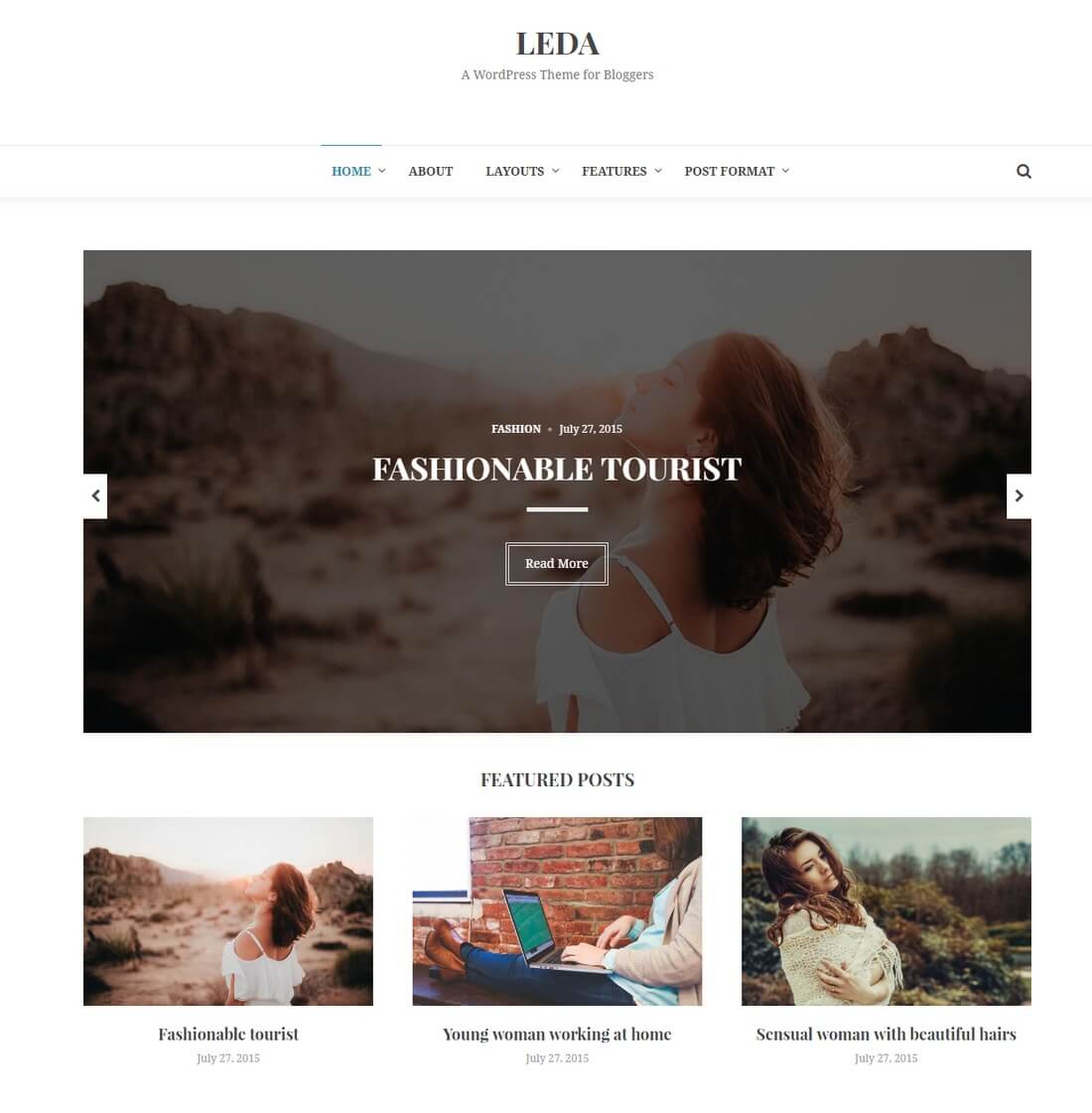
For example, have a look at the layout of Leda WordPress theme. See how its content is arranged and placed throughout the design to achieve the perfect minimalist effect.
2. Large Photos
Another feature you’ll see often on a minimalist WordPress theme is large photography that sometimes takes up the entire screen.
There are a few different ways you can use large photos on a minimalist website, such as large website headers, blog post headers, full-width image backgrounds, and sliders. They also prove useful as a great placement for CTAs (Call To Action) as well. Make sure the minimalist theme you pick has lots of space for photos and gives you more than one option for using photos.
When choosing the photos, you should also make sure the photos you feature on your website play well with the website’s color palette. Minimalist websites normally don’t feature photos with vivid colors.
You might also want to consider whether it makes sense to incorporate a mockup template into the design, to showcase your product or service in a natural setting. So look for placement opportunities in your minimal theme that work with this type of product-placement photo mockup.
3. Bold Typography
A picture may be worth a thousand words, assuming that people can understand hidden meanings in photos, of course. It took decades of research for scientists to figure out why some people see Mona Lisa smiling while others see her face with a serious expression.
Why take a risk? Don’t look for a WordPress theme designed by a modern day Da Vinci. Look for a theme that lets you write down big bold headlines that you can use to easily describe your brand, products, and services.
Pay close attention to what kind of fonts are being used in the theme as well. And see if you could easily customize it to select a font of your choice.
4. Limited Color Palette
You can easily customize the colors of a WordPress theme. So, this shouldn’t be a major concern for you when choosing a minimal WordPress theme, but you should check to see how and where the theme uses colors throughout its design.
For example, at first glance, you may not see what kind of a color a WordPress theme uses for link and image hover effects. And those effects might mess with your content when customizing the design with your brand colors. Like how a dark colored overlay hover effect can ruin the appearance of a B&W photo.
Take a closer look at the color palette used by the theme and how far you are able to customize it. As a rule of thumb, limit your brand color palette to two or three colors max in order to keep the design truly minimalist.
5. Simpler Navigation
The navigation, or the main menu, is one of the core elements of a website. It’s what provides the users with a map of the entire website and an easier road to exploring the website. This is why you need to find a WordPress theme that has a simple, big, and a clear navigation panel.
The website menu doesn’t have to be hidden under a hamburger button to make your website design minimalist, but it’s fine if you prefer it that way. There are lots of minimalist WordPress themes that use modal and hamburger menus. But, an open and a clearly visible navigation will also improve your website engagement rates.
It’s Simple, Really
Simply put, minimalist web design is all about making everything stupid simple by including only the core information on your website. There’s no question about its effectiveness. If Apple can convert thousands of website visitors into customers using the same technique, why wouldn’t it work for you?
If you need some inspiration, be sure to check out our hand-picked collection of the best minimalist WordPress themes.
A Few Favourite Minimalist Themes
Here are a few of our favourite minimal WordPress themes, to get your inspiration flowing (or for you to buy, if any particularly stand out!)
Collective - Multi-Purpose Minimal WordPress Theme
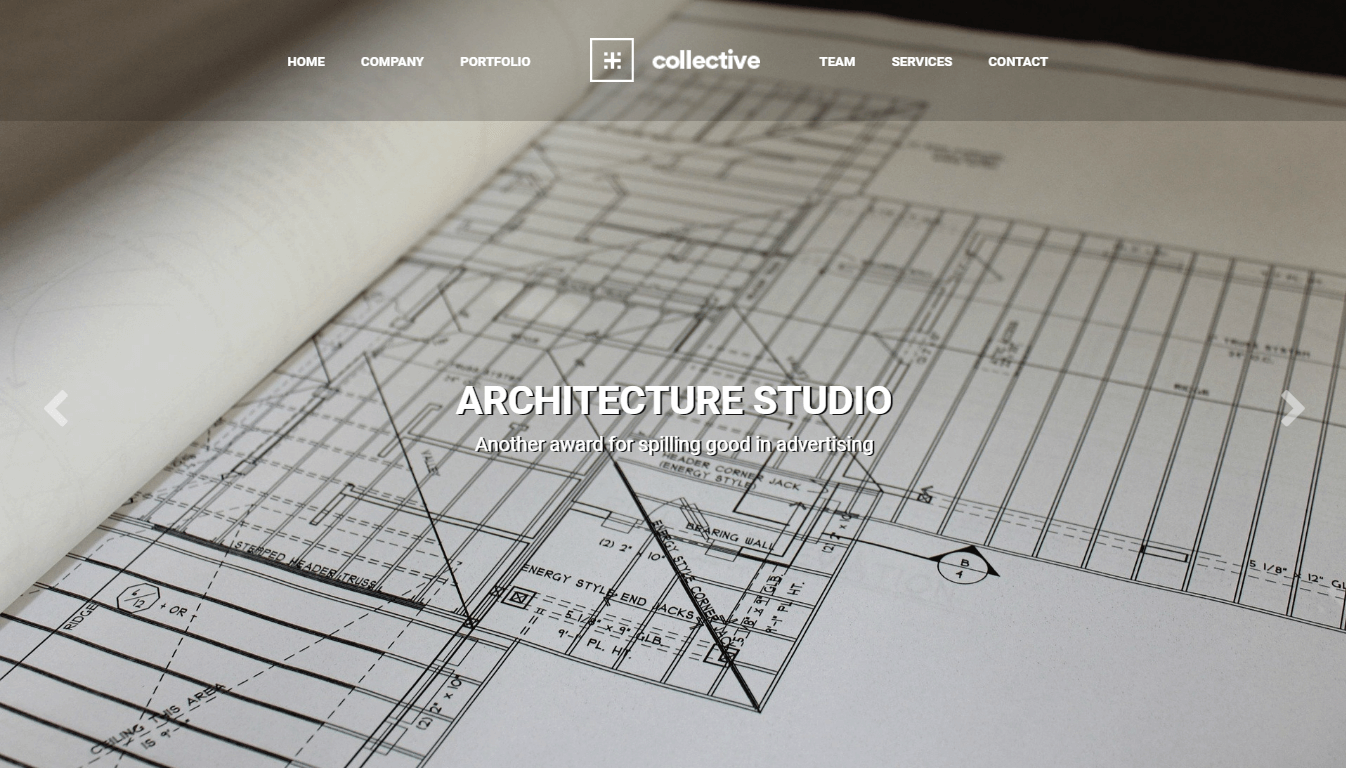
Collective is a multi-purpose WordPress theme that can be used for any project where a minimal design is needed. After importing one of the 12 homepage demos, you can simply add your own content or use the page builder tool and theme customization options to fully personalize your website.
Agency, business, and portfolio websites, as well as ecommerce stores and blogs are all good uses for this theme.
Collective Rating & Updates
| Current Version | 1.4.5 |
|---|---|
| Last Updated | 19 November 2020 |
| Rating | 4.73 (55 reviews) |
Collective Features & Compatibility
| Columns | 4+ |
|---|---|
| Layout Style | Responsive |
| Browser Compatibility | IE10, IE11, Firefox, Safari, Opera, Chrome, Edge |
| Documentation | Well Documented |
| Files Included | PHP Files, CSS Files, JS Files |
| Gutenberg Ready | No |
| High Resolution Ready | Yes |
| Widget Ready | Yes |
Mnml - Minimal WooCommerce WordPress Theme
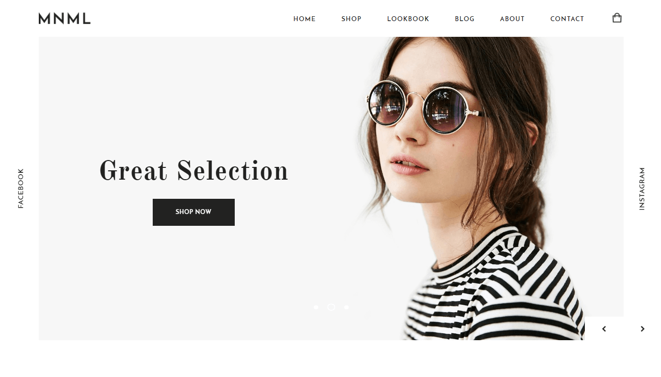
Mnml has everything needed to help you build a stylish and modern ecommerce store with WordPress. This minimal WooCommerce theme is perfect for stores that sell just one product, as well as more traditional multi-product online shops.
There are three homepage layouts to choose from, countless inner page templates, and a drag-and-drop page builder is included too.
Mnml Rating & Updates
| Current Version | 1.4 |
|---|---|
| Last Updated | 22 October 2018 |
| Rating | 4 (31 reviews) |
Mnml Features & Compatibility
| Columns | 1 |
|---|---|
| Layout Style | Responsive |
| Browser Compatibility | IE10, IE11, Firefox, Safari, Opera, Chrome, Edge |
| Documentation | Well Documented |
| Files Included | PHP Files, CSS Files, JS Files |
| Gutenberg Ready | No |
| High Resolution Ready | |
| Widget Ready | Yes |